
We spend our days in other people’s homes. Some are light-filled Georgian townhouses, some are compact new-build flats, others are red-brick terraces with bay windows that have seen a century of London weather. In each one, the shutters we fit take on the character of the room.
Colour is never an afterthought for us. It is as much a part of the design as the louvre width or the joinery. Light behaves differently depending on where you stand. Morning sun through a kitchen turns a pale grey into silver. Afternoon light in a sitting room can warm the same colour until it feels almost beige. We pay attention to these changes before we talk about finishes or fittings.
This article is our way of putting those small observations into one place. We are not going to list trendy paint colours. We are going to talk about the approach we use when matching shades to light, to architecture, and to the mood a room is meant to hold.
How colour behaves on shutters, specifically
Most colour advice is written for walls. Shutters behave differently.
Angles create micro-shadows. Tilted louvres throw a fine shadow at every slat edge, which deepens mid-tones and can flatten pale pastels. A soft sage on a sample card can read nearer olive once fitted.
Colour shifts through movement. Open panels brighten and cool the colour; closed panels concentrate it. If you want a restful bedroom, choose a shade that still feels calm in the closed position at night.
Gloss level matters. Matt absorbs light and hides small dust; satin reflects more and feels sharper; high gloss highlights every fingerprint. Most homes in Surrey and South West London area suit satin or low-sheen for a balanced, tailored look.
Light Reflectance Value (LRV). This number indicates how much light a colour bounces back. Think of 80 to 90 as very bright whites, 60 to 70 as airy neutrals, 30 to 45 as moody mid-dark, and 10 to 15 as dramatic near-black. Use LRV as your compass, not the romantic name on the tin.

Read the room: orientation, glazing, and surroundings
London sits around 51.5°N, so the sun rides lower than in southern Europe and the sky often reads cool.
North-facing rooms receive cooler, flatter light. Warm whites, stone, oatmeal, mushroom, and greige with a red or yellow undertone bring life back. Target LRV 60 to 80.
South-facing rooms love restraint. They are bright already, so they can carry cooler whites, pale grey-greens, powder blues, and even deep ink. LRV 35 to 65 works well.
East-facing rooms feel clear and blue in the morning, slightly muted later. Peach-tinted neutrals, blush greys, and soft greens balance the shift.
West-facing rooms glow in the evening. Avoid over-warm creams that can look yellow at sundown. Go for olive-grey, soft taupe, or off-black for drama.
Street and garden factors. Plane trees in Richmond or Wimbledon cast green shade that cools interiors. Red-brick refraction can warm ground floors in Twickenham and Barnes. If you see a persistent colour cast at certain times, compensate in your shutter paint.
The psychology of colour
This is the part many guides oversimplify. People carry personal associations, but some responses are remarkably consistent.
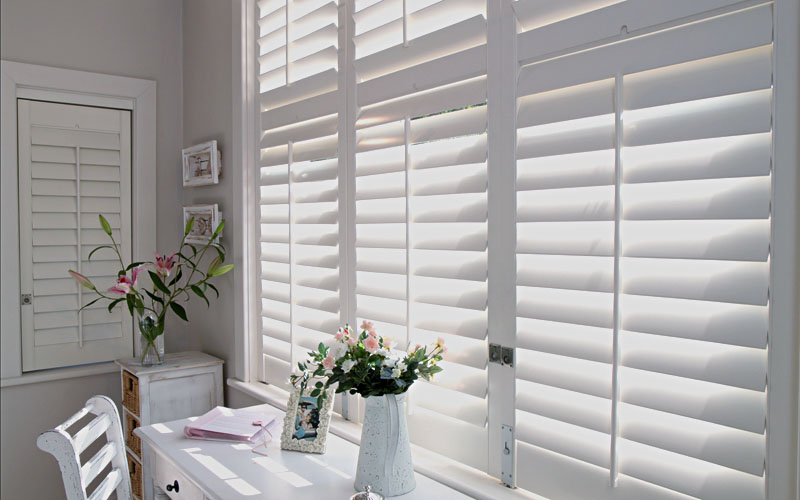
Whites and near-whites. Clean, expanding, gallery-smart. Blue-based whites feel crisp, great with stainless kitchens and contemporary extensions. Red-based whites feel gentle and are kinder to complexions, lovely in living rooms and bedrooms. Keep an eye on LRV to avoid glare in very bright bays.
Greys. Cool greys can feel polished in modern builds around Putney and Wandsworth, yet chilly in shaded cottages. Warm greys with a touch of brown or red feel composed in period rooms with cornicing.
Greige and stone. The grown-up choice. They bridge old and new, play well with oak floors and limestone hearths, and read luxurious without shouting.
Blues. Pale blue calms. Mid denim feels honest and family-friendly. Deep navy signals structure and pairs beautifully with brass hardware. Bedrooms, studies, and hallways love blue when the rest of the scheme is warm.
Greens. The Surrey favourite. Sage, olive, and eucalyptus tones borrow from the landscape and settle the eye. Kitchens and garden-facing rooms look tailored in green.
Warm neutrals. Oat, almond, light caramel. They soften north light and flatter skin tones, ideal for sitting rooms and dining spaces.
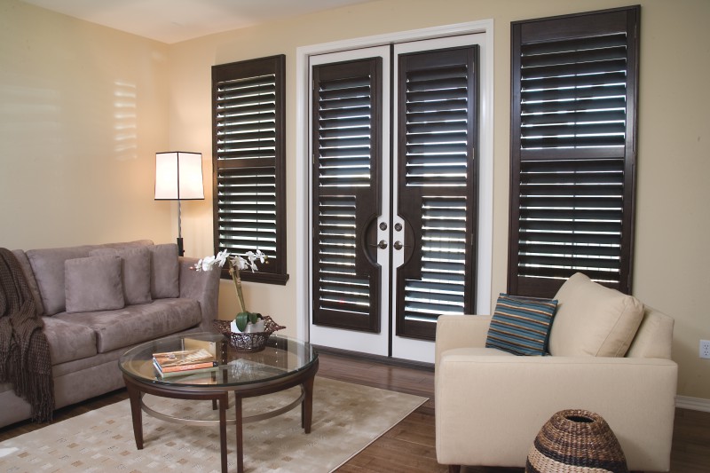
Off-black and charcoal. Sophisticated, slimming to the window, great for busy streets in Clapham or Balham. Pair with lighter walls to avoid a cave effect.
Earth reds and terracotta. Small doses for breakfast nooks or reading corners. Too much can feel restless, but a muted red on café-style shutters adds charm in a Victorian bay.

Room-by-room colour strategy
Living room
Aim for sociable calm. Warm whites, stone, or soft greige create a canvas for art and books. If the room carries bold colour elsewhere, off-black shutters add structure without stealing the show. In grand Victorian receptions with high skirting and ceiling roses, warm grey shutters tie ornate features to modern furniture.
Kitchen
Clean lines meet practical finishes. Blue-greens feel fresh with marble or quartz. Crisp white shutters with a low-sheen finish bounce task light back onto worktops. If your kitchen opens to a garden, olive tones blur the threshold in summer and still feel grounded in winter.
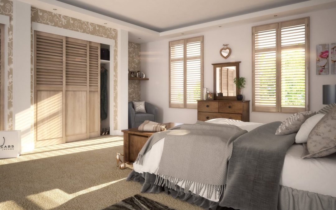
Bedroom
Sleep wants low visual temperature and limited contrast. Deep blue, misty green, or warm mushroom read restful when panels close at night. Satin sheen helps with easy wipe-down while avoiding glare. If walls are dark, consider a lighter shutter for a cocoon effect that does not feel heavy.
Home office
Focus with a hint of optimism. Muted teal, sage, or warm stone help with long screen hours. Tier-on-tier shutters let you drop the lower panels for privacy and keep the upper section bright. Colour on the lower tier only can anchor the desk zone without darkening the ceiling line.
Bathroom and cloakroom
Moisture calls for a stable substrate and robust paint. Choose ABS or composite in splash zones, then use coastal blues, chalky whites, or eucalyptus. Avoid pure optic white next to older sanitaryware, as it can make fixtures look tired.

Hallway and landing
These areas set the tone for the whole house. Off-white with a subtle warm undertone flatters mixed flooring and a carousel of shoes and coats. If the staircase is stained oak or painted dark, a deeper shutter shade can tie elements together.
Nursery or playroom
Friendly, not sugary. Think pale green, dusty lavender, or buttercream rather than high-energy primaries. Low-sheen finishes clean easily. Avoid very high LRV whites that bounce light at nap time.
Make colour earn its keep with shutter design
Panel style. Full-height shutters feel formal and elongate windows in 1930s semis. Café-style suits street-level privacy in Putney or Fulham roads. Tier-on-tier gives flexibility for mixed-use rooms.
Louvre width. Wider slats look contemporary and let more light in, so colours read lighter. Narrow slats feel traditional, deepen colours, and suit small panes in Georgian and early Victorian sash windows.
Framing and beading. On period homes, a soft off-white frame with coloured panels keeps cornices and architraves visually connected. In modern builds, a colour-matched frame looks seamless.
Materials, finishes, and longevity
Substrate. Hardwood takes a finer profile and holds paint crisply. Engineered timber resists movement. MDF works in dry rooms, not for high humidity. ABS or composite shines in bathrooms and near sinks.
Paint system. A waterborne polyurethane or acrylic with UV inhibitors keeps colour stable. Oil-rich systems yellow over time in low light. Low-VOC finishes keep indoor air calmer during curing.
Sheen choice. Matt hides micro-scratches but marks more easily. Satin balances cleanability and elegance. Reserve high gloss for small accents or ultra-modern schemes.
Maintenance. Dark colours show dust sooner. Pale colours show scuffs around the tilt rod. A soft brush attachment weekly and a microfibre wipe monthly keep things pristine.

Heritage homes vs modern builds
Victorian and Edwardian terraces. Deep blues, off-blacks, warm greys, and stone look authentic against red brick and original floors. Café-style in the front room with a mellow neutral prevents a fish-bowl effect and still lets cornicing glow.
Georgian proportions. Understated elegance. Warm off-white or stone on shutters aligns with lime-based wall tones and wide skirting. Avoid cool blue-white in very old rooms, as it can fight with aged timber.
1930s semis. Greige, soft green, and taupe complement leaded glass and curved bays. Medium louvre width keeps scale right.
Contemporary extensions. Crisp white, eucalyptus grey, or inky blue against concrete, steel, and big sliders. Go wider on louvres and keep framing minimal.
Neutrals done properly
White is not one thing. It carries undertones. Under artificial light, a violet-leaning white can turn pink, a green-leaning white can turn slightly mint. Test next to your wall, flooring, and window trim. If the skirting is a standard trade white with a cool cast, choose a cool-leaning shutter white or go purposefully warmer so the contrast looks intentional.
Greige is the diplomat. If you cannot decide between grey and beige, reach for a mid-tone that sits between them. It flatters oak, walnut, and painted kitchens, and it never looks dated.
Dark drama without the gloom
If you want a boutique-hotel mood in a sitting room or snug, choose charcoal, off-black, or very deep green. Keep the surrounding walls lighter, add a reflective element such as a brass floor lamp or a pale rug, and specify satin sheen so the surface lifts ambient light. In street-facing rooms, darker shutters feel secure and hide at night, which reads restful.
Practical colour tactics that clients love
Two-tone shutters. Colour on the street side to coordinate with exterior cues, softer white on the room side. Useful for cottages in conservation areas around Richmond Green and Wimbledon Village.
Lower-only colour. In tier-on-tier sets, paint the lower panels a mid-tone to anchor furniture lines. Keep uppers pale for daylight.
Frame contrast. Off-black frame with warm grey panels creates a tailored suit effect. Very smart in minimal interiors.
Case notes from local homes
Wimbledon terrace, living room bay. North-facing, red-brick reflections, original cornice. We used warm stone shutters at LRV around 65, narrow louvres to respect the slim glazing bars, and a low-sheen finish. The room finally felt warm without turning beige.
Barnes riverside flat, open-plan kitchen. South-west light, lots of glass. Crisp blue-green on full-height shutters balanced the golden evening glow. Stainless appliances looked intentional, not cold.
Guildford townhouse, master bedroom. Street noise and strong summer light. Off-black full-height shutters with a satin sheen and wider louvres, walls in a gentle white. The client reported good sleep and a calmer morning routine.
Sampling like a pro
- Order large sprayed samples, not tiny chips. Place them on the shutter frame and watch across a full day.
- View with louvres tilted up and down. If the colour pleases you in both positions, it will serve you well.
- Compare under your actual bulbs. Warm LED can add 200 to 300 Kelvin of warmth. A cool green may turn murky under very warm lamps.
- Check alongside floors and worktops. Wood undertones can pull unexpected colours from paint.
A word on regulations
Internal window shutters rarely trigger planning conditions. Listed interiors can be a different story. If your address sits in a conservation area, we can advise on sympathetic colours that keep character intact and avoid friction with local guidelines.
The short list, if you want one
- North light needs warmth, south light likes restraint.
- Use LRV as your neutral reference point.
- Satin or low-sheen finishes feel best in most London homes.
- Greens and blues calm; off-black adds structure; greige solves difficult rooms.
- Test on large samples through a full day, louvres open and closed.
Ready to see colour in your own space?
If you live in Surrey or Southwest London, we can bring samples to your home, hold them against your windows and build a palette that fits the architecture and the way you live. Our aim is very simple. Calm rooms, flattering light, and shutters that look like they have always belonged there.
Book your free in-home consultation today!